Better scan reliability
High contrast helps phones detect the QR pattern quickly on menus, posters, cards, labels and packaging.
QR contrast checker helps you test foreground and background colors before printing or publishing a QR code on menus, flyers, packaging, signs, cards and business campaigns.
Contrast planning
Scan friendly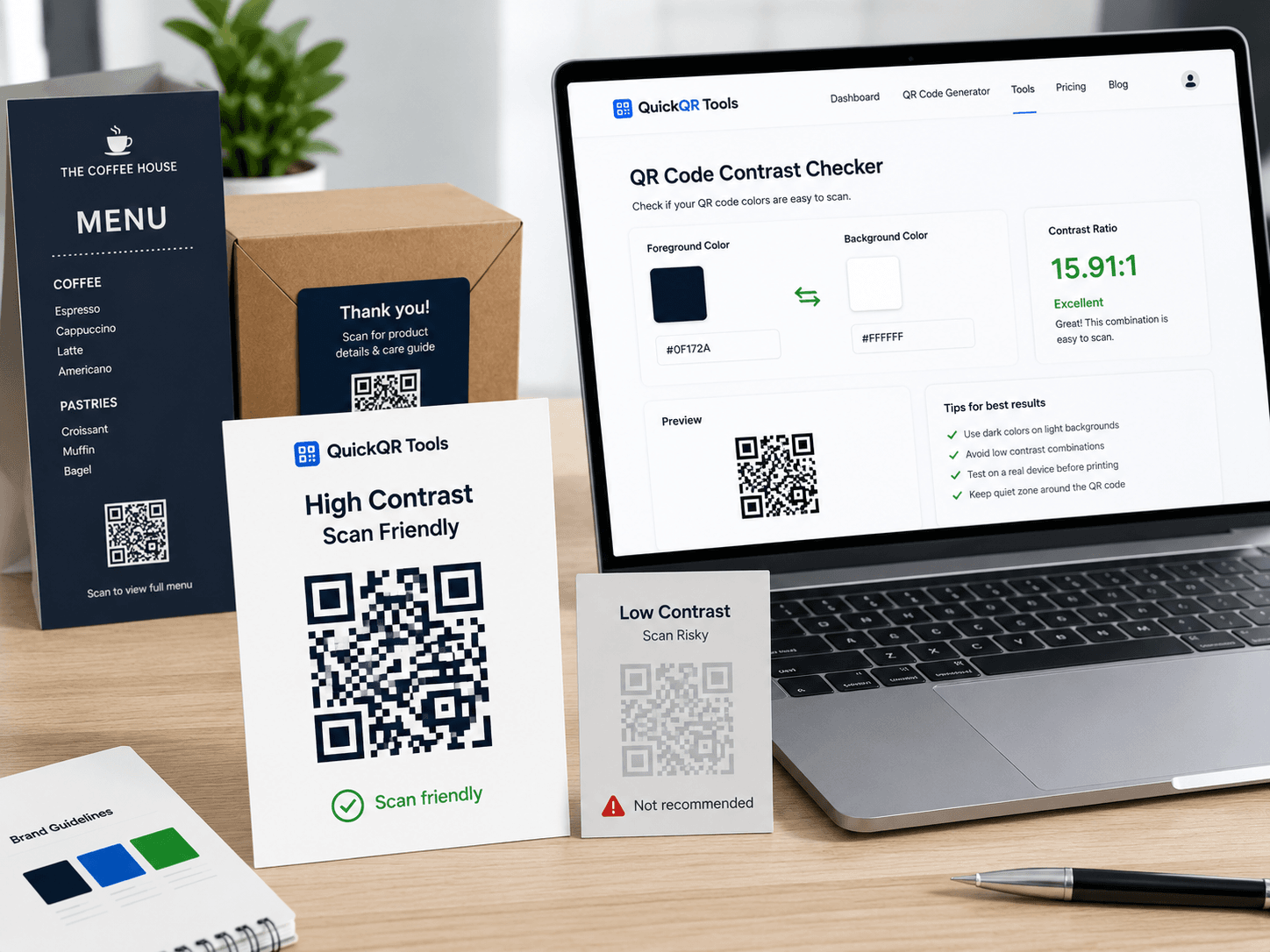
Choose the QR code color and the background color. This qr contrast checker calculates the contrast ratio and gives a practical recommendation for printed and digital QR codes.
Use the final colors from your design, not approximate colors from a screenshot.
Contrast result
This color combination is strong for QR code scans and suitable for most business print and digital uses.
A QR code can be perfectly generated and still perform poorly if the colors are too soft, too similar or reversed in a way that makes scanning difficult.
High contrast helps phones detect the QR pattern quickly on menus, posters, cards, labels and packaging.
A qr contrast checker helps catch risky color choices before designs are sent to print or shared with a client.
Customers should not struggle to scan. Clear contrast makes the physical-to-digital journey feel simple and reliable.
Use this qr contrast checker before using brand colors on printed QR codes. These mistakes are common on beautiful designs that fail in real settings.
Pastel blue, pale green, yellow, beige and soft gray can reduce scan reliability, especially on textured paper or under weak lighting.
Even with good contrast, a QR code needs clear space around it. Keep a clean margin between the code and nearby text, images or borders.
White QR modules on a dark background can work in some cases, but it is less predictable. Test it carefully before using it in campaigns.
Photos, patterns and gradients behind a QR code can confuse scanners. Use a solid light panel behind the code whenever possible.
Different placements need different safety margins. A business card scanned close up is more forgiving than a window sign scanned outside.
| Use case | Recommended contrast | Practical advice |
|---|---|---|
| Business cards | Strong contrast | Use dark navy, black or deep brand colors on white or very light backgrounds. |
| Restaurant menus | Strong to excellent | Menus are often scanned in uneven lighting, so avoid soft colors and small QR codes. |
| Product packaging | Excellent preferred | Packaging can be glossy, curved or textured. Use extra contrast and test a physical sample. |
| Posters and window signs | Excellent preferred | Outdoor light, reflections and distance increase risk. Use bold contrast and larger QR sizes. |
| Digital screens | Strong contrast | Avoid glare, animations behind the QR and low-brightness displays. |
The workflow is simple: test the colors, generate the QR code, choose the right size and then test the final printed result.
Enter the QR foreground color and the background color from your design.
Review the ratio, scan risk and recommendation from the qr contrast checker.
Use a QuickQR generator to create the final QR code with a clean destination.
Scan the final layout from the real distance and lighting before producing a full batch.
Use these tools together to plan a QR code that is readable, correctly sized and useful in the real world.
Create a standard website QR code for pages, campaigns and business materials.
Estimate the right printed QR size based on scan distance and material.
Estimate how far people can scan a printed QR code from its size.
Explore the full QuickQR Tools library for business QR workflows.
These guides help you go beyond the checker and build QR codes that work across print, marketing and customer journeys.
Learn print size, placement, quiet zone, contrast and testing best practices.
Understand how QR codes work and how businesses use them professionally.
Use QR codes in campaigns, packaging, flyers, posters and customer touchpoints.
Check QR contrast before printing product packaging, labels, shelf cards and retail displays.
Review branded QR contrast for creator merch, stickers, posters and event materials.
Review practical sizing tips for printed materials and scan distances.
Review verified QR code statistics for mobile scanning, business usage and print-to-digital campaigns.
Use these answers to make safer color decisions before publishing or printing business QR codes.
A qr contrast checker is a tool that compares the QR code color and the background color to estimate whether the combination is strong enough for reliable scanning.
A high ratio is safer. For business print, aim for strong contrast, ideally dark foreground on a white or very light background.
Yes, but brand colors should be tested. Dark navy, deep blue and dark green often work better than pale, bright or low contrast colors.
Black and white is the safest option, but it is not the only option. Colored QR codes can work when contrast, quiet zone and print quality are strong.
Reversed colors can be less predictable. If you use a light QR code on a dark background, test the final version carefully on multiple phones.
Yes. Paper, ink, lighting, glare and texture can reduce contrast. Printed QR codes need more safety margin than QR codes shown on a clean digital screen.
No contrast checker can guarantee every scan. Size, distance, quiet zone, resolution, destination and phone camera quality also affect results.
Generate the QR code, place it in the final design, print a sample and scan it from the expected distance under real lighting conditions.
QuickQR focuses on practical business QR workflows. These external resources provide additional technical context for contrast and QR standards.
Check your colors, choose the right size and create a professional QR code for your business materials.